This was a project for a Google UX design course | September 2022
I signed up for the course in order to broaden my skill set outside of graphic design and wordpress website building
Scooter and delivery bike drivers tend to leave repairs until the last minute due to budget constraints. This app/site gives a platform to buy and sell new and used parts
The app was meant to help drivers of scooters, motorcycles etc to buy cheaper parts
The project is to assist low income users with sourcing parts to keep their travels safe.
This was a solo project and as such I was responsible for all aspects of the project
The Problem
Scooter and bike parts are expensive. Driving without repairing issues is dangerous. Buying from online platforms can be dangerous.
The Goal
Have one place to buy and sell new and used parts safely.
User research: summary
We gave users and online survey and a link to the low fidelity prototype in order to conduct a usability study.
1. Buttons did not redirect
Buttons did not redirect correctly and confirmation pages were needed
Redirects were fixed and confirmation pages added
2. Sizing issues
There were sizing issues with different phones
The size was changed to a smaller one as it would work on bigger devices too
3. Overlays
Overlays were too light, it made them too difficult to read
Overlays were made less transparent
- Study type: Unmoderated usability study
- Location: South Africa
- Participants: 5 participants
- Length: 10-15 minutes
USER PERSONAS


IDEATION
The main layout changed drastically early on with a simplified home page.
I first thought that a leisure vehicle section was pointless as people who have 4 wheelers (for example) just for weekends can afford the parts.
But then I realized that if the vehicles don.t get used often, maybe they would rather spend less on parts, so it was added back as a category


Digital wireframes
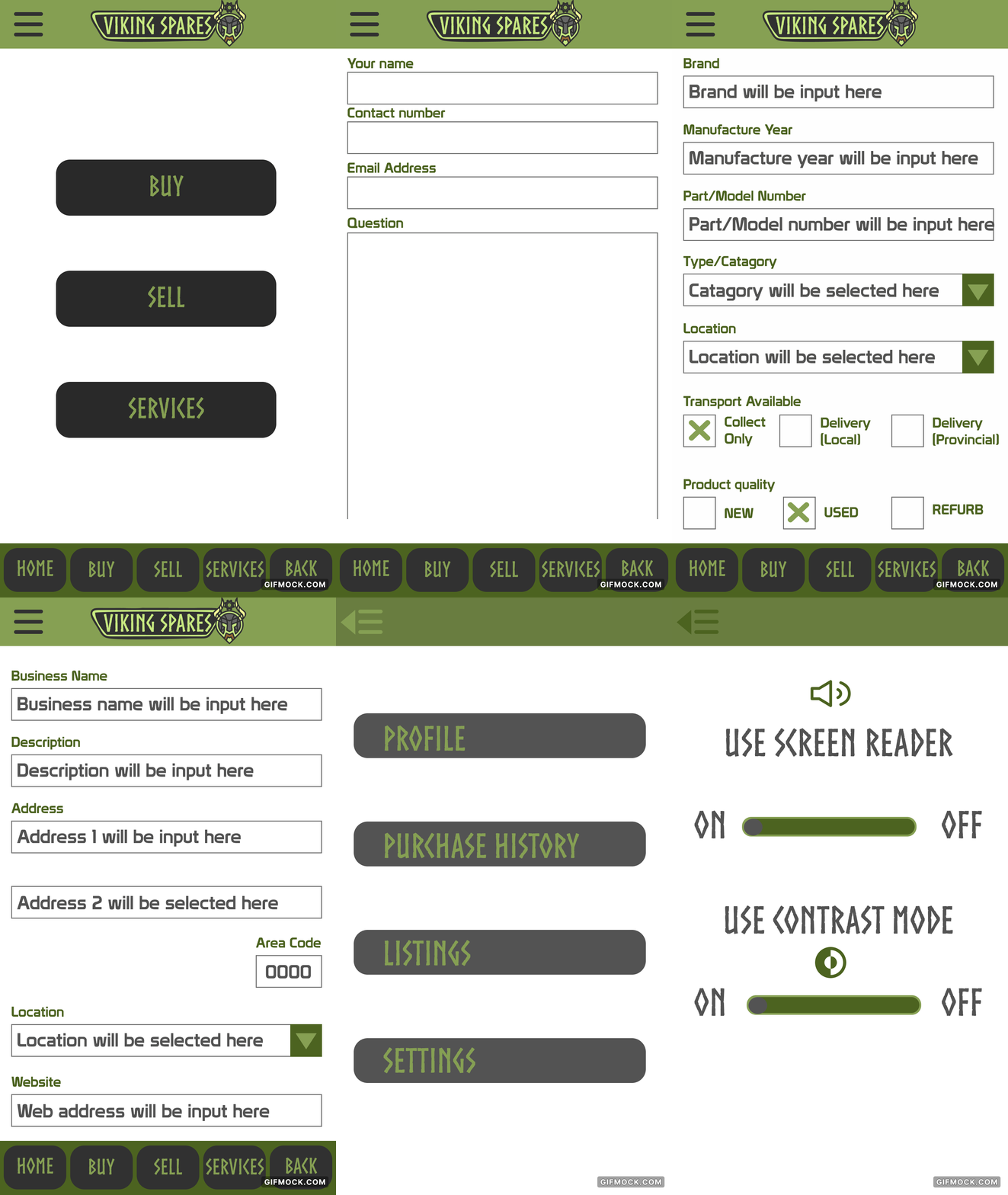
The wireframes were made as simple and easy to use as possible

Low fidelity prototype
2nd Iteration

High definition prototype


